
When your clickbooq website is viewed on a mobile device such as iPhone or Android, it is automatically formatted for optimal Mobile viewing.
In order to better utilize the more commonly-used Portrait orientation of Mobile devices, some Desktop Gallery styles are converted to Mobile Gallery styles when viewed on a Mobile device. These automatic conversions include:
- Slideshow and Horizontal Scroller styles are converted to Grid: Masonry Fluid*
- If your Desktop gallery style is a Grid (Rows Ragged, Masonry Fixed, or Uniform Fixed), they will be converted to Rows: Filled, Masonry Fluid, and Uniform: Fluid accordingly. All other Grid styles will be rendered as specified on Mobile.
*This conversion can not be overridden, but you can customize how the Grid conversions appear on Mobile devices. Customization of the Grid conversion on Mobile devices can be made on a global Design level or as part of the Custom Gallery Settings on a per-Gallery basis as outlined below.
Customize the Global (default) Grid Style for Mobile Devices
Even if your currently selected Gallery Style is Slideshow or Horizontal Scroller, you can customize the appearance of the Grid conversion on Mobile devices.
To customize the appearance of your Grid gallery on Mobile, Access the Design [tab], then expand the Gallery panel.
Temporarily change the Gallery style from Slideshow or Horizontal Scroller to Grid, then select the desired styling options for the chosen Grid style.
When you are finished with the Grid Options, change the Gallery Style back to your original Gallery Style. This will save your Grid Options for the Mobile view, but retain your main style for Desktop view.
Then, click the Save and Publish button to effect your changes and view your website on your Mobile device to see your modifications.
Customize the Grid Style on a Per-Gallery basis
If you only want to change the Grid style for specific Galleries, you can use the Custom Gallery Settings feature to affect the Grid style for a chosen gallery:
Access the Gallery's Settings by clicking on the Gear icon next to the Gallery's name:

Change the Style to Grid, then choose the desired Grid Options:
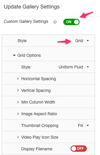
When you are finished with the Grid Options, change the Gallery Style back to your original Gallery Style. This will save your Grid Options for the Mobile view, but retain your main style for Desktop view.
Mobile Fullscreen Gallery
If you wish to display your Homepage slideshow with a fullscreen effect on Mobile devices, you can toggle an additional option for Mobile Fullscreen. To achieve the fullscreen effect, make sure that Cropping is also set to Fill as shown below. Note: Mobile Fullscreen is only available as a Custom Gallery Settings feature.
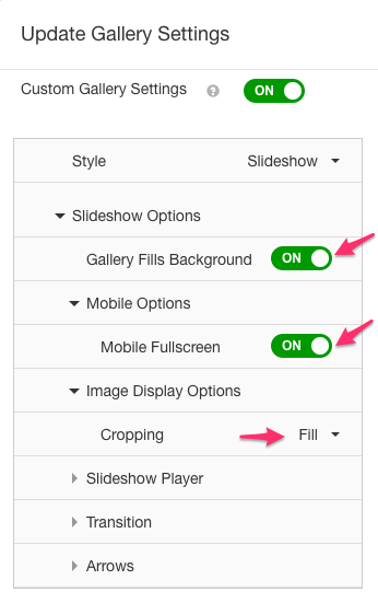
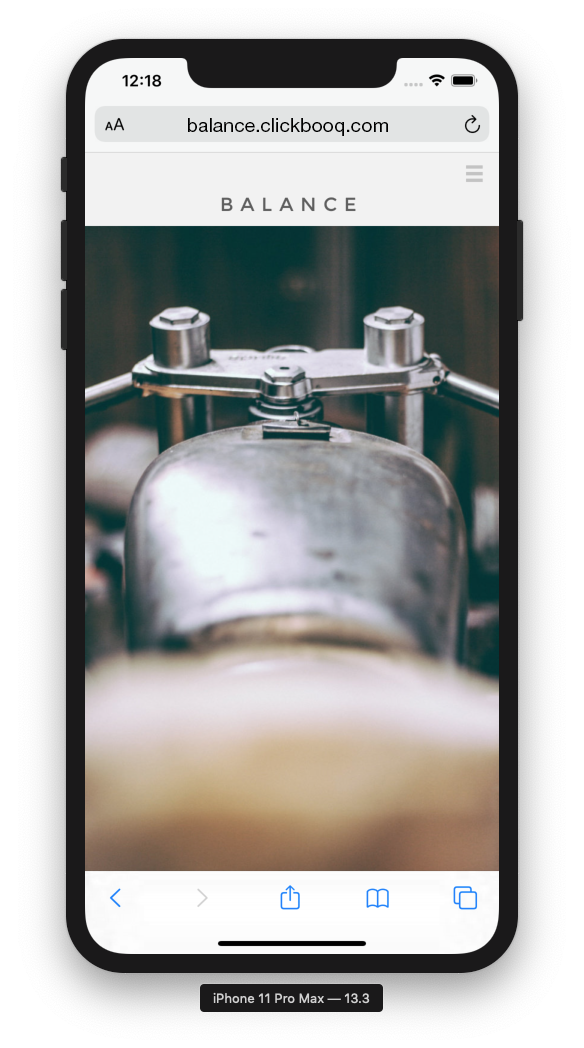
Note: Since most devices are viewed in Portrait mode, but most images are oriented in Landscape, the fullscreen option will likely result in excessive cropping of your images with this feature enabled. Test your homepage on your device to see if this option works for your Homepage images.
Comments
0 comments
Article is closed for comments.